Choosing the Right Color for Labels and Packaging
The right color plays a crucial role in the world of branding. It can evoke emotions, convey messages, and even influence purchasing decisions. This is especially true when it comes to the color scheme for labels and packaging.
In this guide, we will explore how to choose the right color scheme for your brand’s labels and packaging, keeping in mind the latest packaging trends and label printing techniques.
Understanding the Importance of Color in Packaging
Before we delve into choosing the right color scheme, it’s essential to understand why color matters so much in packaging/labeling. Color is one of the first things a consumer notices about a product. It can make a product stand out on a shelf, convey a certain mood or feeling, and influence a consumer’s brand perception.
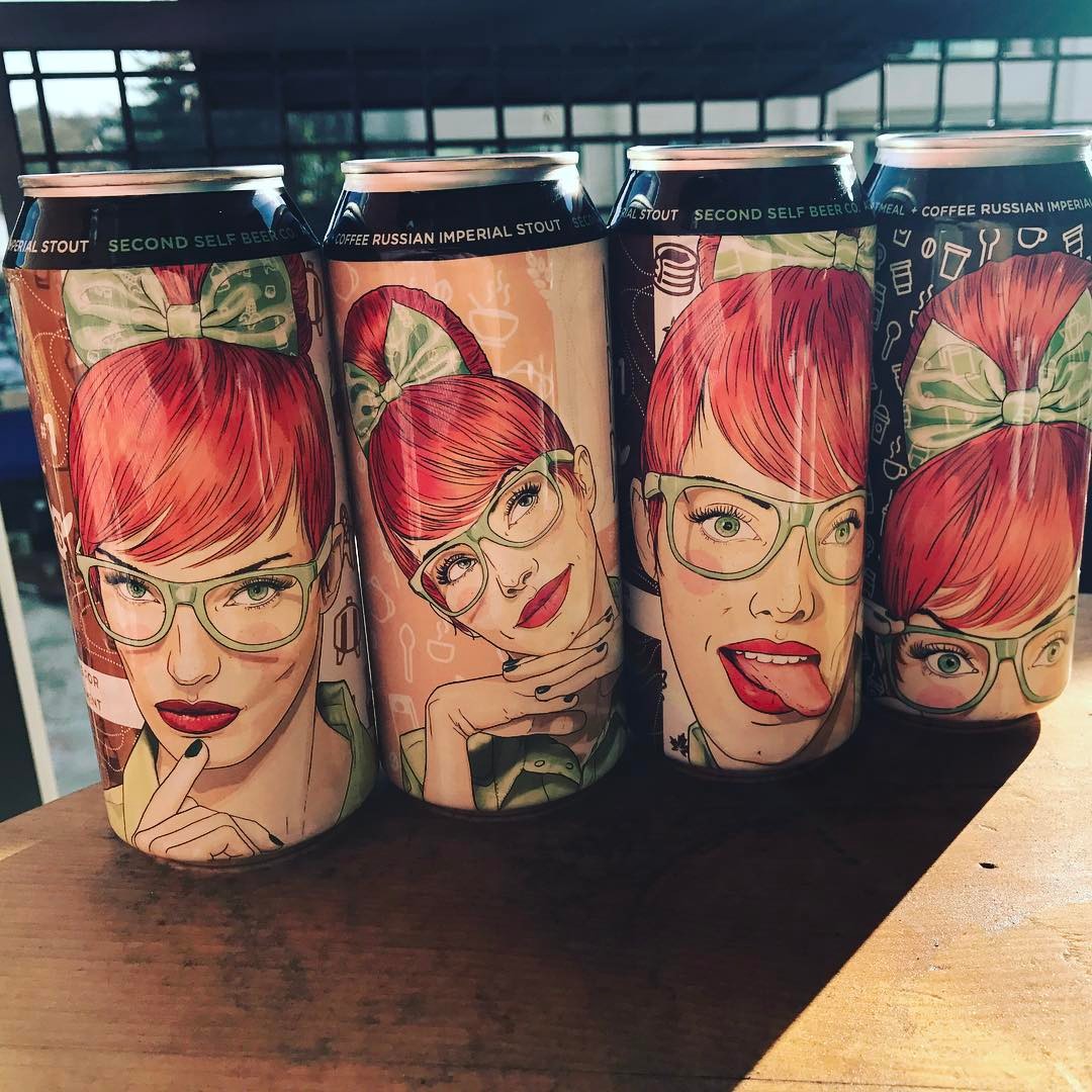
For instance, green is often associated with natural or eco-friendly products, while red can evoke feelings of excitement or urgency. Therefore, choosing the right color scheme for labels and packaging is about aesthetics and communicating your brand’s values and personality.
Keeping Up with Packaging Trends
It’s also essential to keep up with the latest packaging/labeling trends when choosing a color scheme. Recently, there has been a shift towards more minimalist and sustainable packaging. This has led to a preference for neutral and earthy colors, such as browns, greens, and blues.
However, this doesn’t mean that vibrant colors are out of fashion. Bright and bold colors can still be effective, especially for brands that want to convey a sense of fun or energy. The key is to choose a color scheme that aligns with your brand’s identity and the current packaging trends.
Considering Label Printing Techniques
The label printing technique is another factor to consider when choosing a color scheme. Different printing techniques can produce different results, so selecting a color scheme that will look effective in print is crucial.
For instance, digital printing can produce vibrant and detailed labels, making it a good choice for complex color schemes. On the other hand, what is called flexographic printing, is more suited to simple color schemes.
More Color Scheme Tips
Now that we’ve covered the importance of color in packaging, the latest packaging trends, and label printing techniques, here are some tips for choosing the right color scheme for your brand’s labels and packaging:
- Understand your brand: Your color scheme should reflect your brand’s personality and values. For instance, a vibrant color scheme might be a good choice if your brand is all about fun and excitement.
- Consider your target audience: Different colors can evoke different emotions in different people. Therefore, it’s important to consider your target audience when choosing a color scheme. For instance, a bold and modern color scheme might be effective if your target audience is young and trendy.
- Test different color schemes: Don’t be afraid to experiment with different color schemes. You can create mock-ups of your labels and packaging and get feedback from your team, customers, or a focus group.
To sum up, choosing the right color scheme for labels and packaging is crucial to branding. By understanding the importance of color, keeping up with packaging trends, considering label printing techniques, and following the tips above, you can create labels and packaging that look good, effectively communicates your brand’s identity, and should we never forget, increases sales.
Genflex Labeling Solutions has been a leading provider of packaging and labeling solutions for over 90 years. We are dedicated to helping your brand and your products succeed. Discover more about GEN Flex and General Paper Company here.